

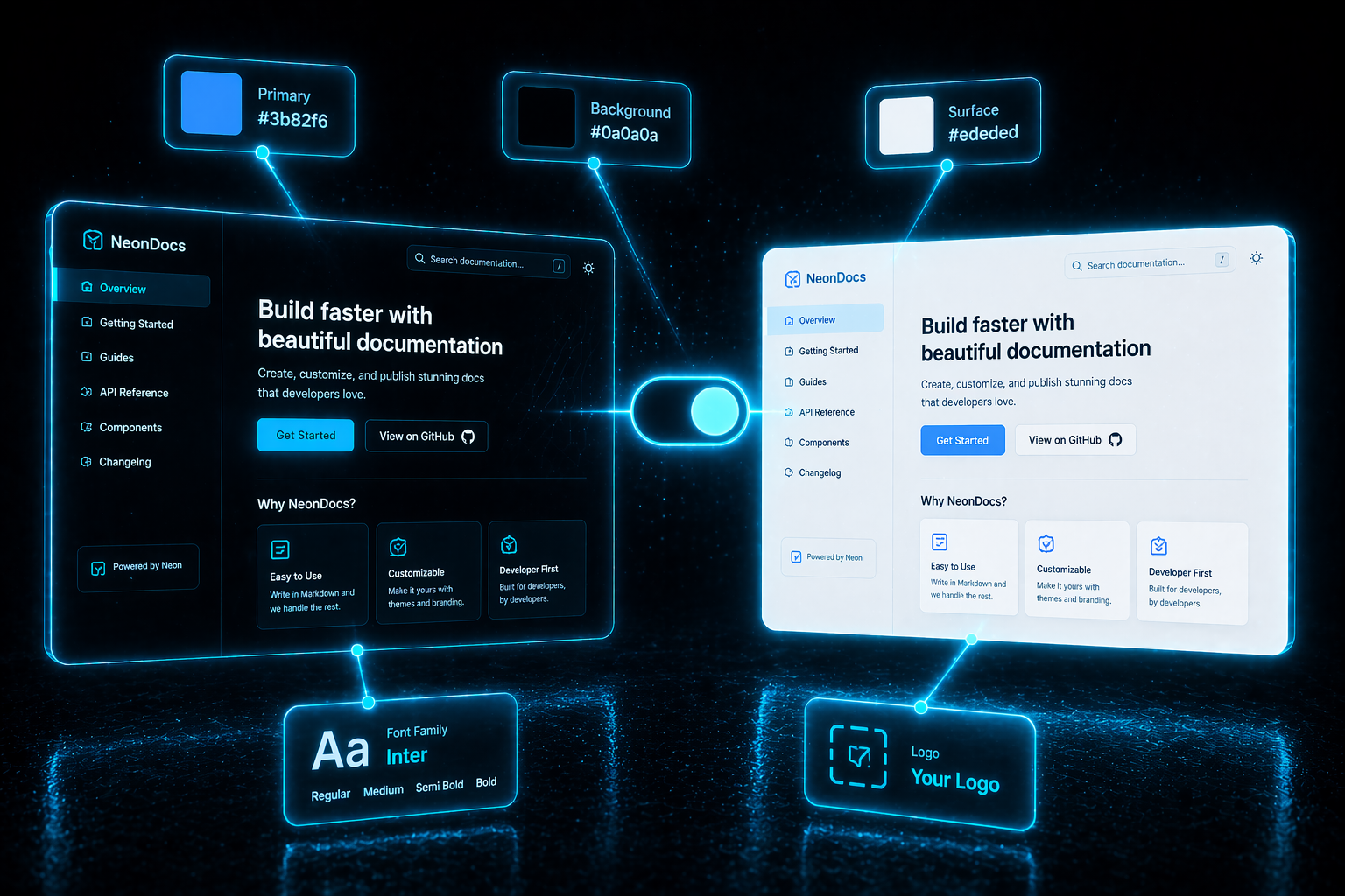
Your documentation site should feel like a natural extension of your product. The Theme page (accessible from the dashboard sidebar) gives you one place to customize every visual element readers will see — logos, colors, fonts, navbar, footer — with a live preview so you know exactly how it'll look before publishing.
Everything here is configured through the UI, not MDX. Changes apply to every page the moment you hit Save.
Logo and favicon
Logo
Upload your logo independently for dark mode and light mode so you can use different versions (a white mark on dark, a colored mark on light). Each theme card has its own logo uploader.
Accepts any common image format (PNG, SVG, JPG, WebP)
Max file size: 2 MB
You can paste a URL instead of uploading if the logo already lives on your CDN
If you only upload one, it's used across both modes.
Favicon
The small icon shown in the browser tab. Configured once and reused everywhere.
Accepts
.png,.ico,.svgMax file size: 1 MB
URL input also supported
Show project name next to logo
A toggle that controls whether your documentation's name is displayed beside the logo in the navbar. Default: on.
Turn it off if your logo already contains the project name — avoids visual redundancy.
Colors
GitDocAI supports two color modes (dark and light), each configured independently. The Dark theme and Light theme cards on the Theme page mirror each other with the same controls.
Color fields per mode
Every color field accepts:
A hex value typed directly (e.g.,
#3b82f6)Or a color picker (click the swatch to open)
Solid vs gradient backgrounds
For the Background field specifically, you can toggle between:
Solid — a single hex color
Gradient — a linear gradient with an angle (presets 0–360°) and up to 5 color stops along the 0–100% range
Default color values
Typography
Choose the font family that renders across your entire site. The font picker offers:
A searchable list of Google Fonts organized into Sans-serif, Serif, Monospace
System fonts (
system-ui,-apple-system) which load instantlyA custom name field if you want a font not in the curated list
Default: Inter — a widely loved sans-serif designed for screen reading.
Google Fonts load on-demand when a reader visits your site — you don't need to host them yourself.
Navbar
Add links to the top navigation bar to point readers to relevant places — your GitHub repo, a changelog, a contact page, a "book a demo" call-to-action.
Drag and drop to reorder. Use + to add, the trash icon to remove.
Keep one Primary button at most. It's the visual call-to-action — having two competes for the reader's attention.
Footer
A toggle at the top of the Footer section lets you enable or disable the entire footer. When disabled, your site has no footer at all.
Footer links follow the same shape as navbar links (icon, label, URL, style). Typically used for social links and legal pages (Privacy, Terms, Contact).
A single-line Copyright text input renders centered under the footer row.